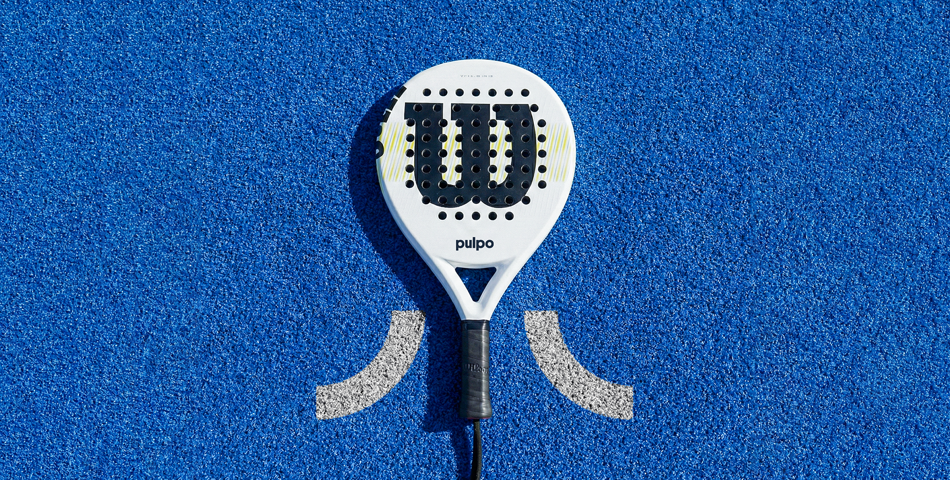
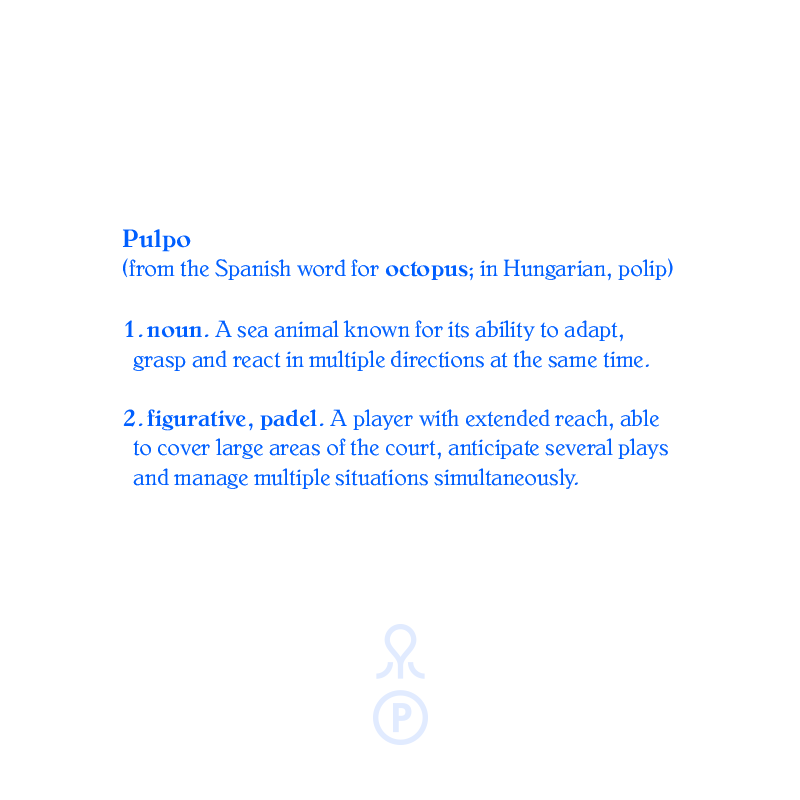
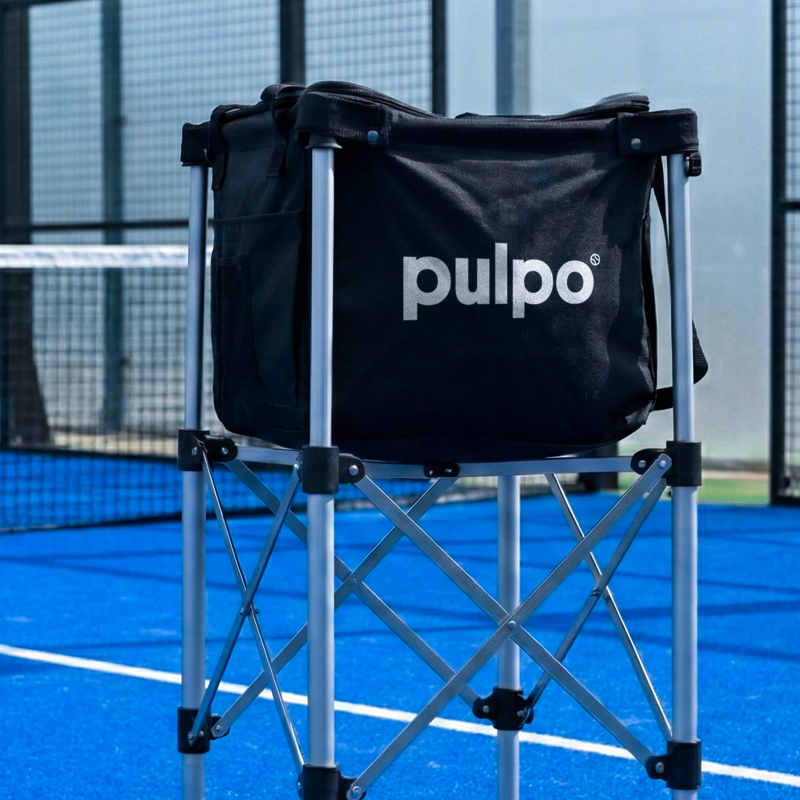
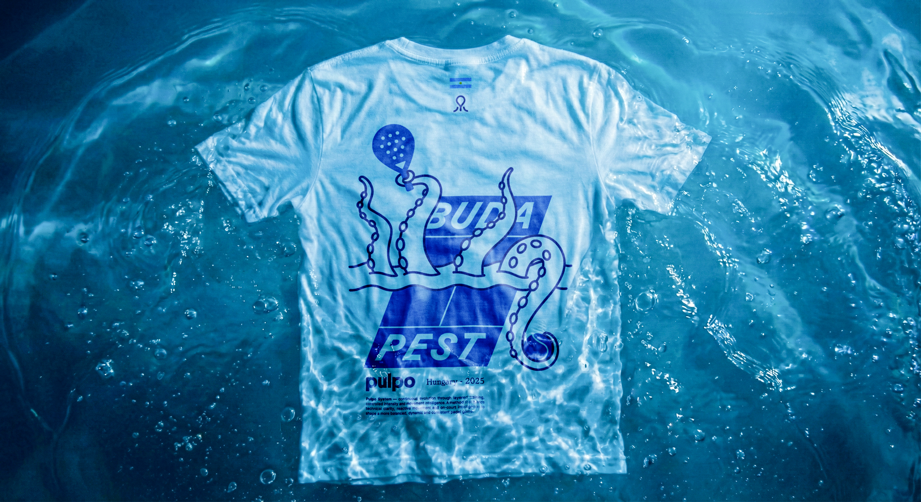
PULPO is the visual identity created for an Argentine pádel coach based in Hungary.
After teaching in Argentina and Denmark, he settled in Budapest, Hungary, to contribute to the development of the sport in the city and the country.
Pulpo is not a traditional sports brand
It is a human-centered brand designed to create connection.
The visual identity does not aim to look overly athletic. Instead, it was built to feel emotional, social, and didactic. It is flexible and friendly, with strong character, and it works both on the court and beyond it.
Pulpo is about performance, but also about learning, improving, and building community.


The logo works as both an icon and a signature mark.
It’s flexible for embroidery, printing, and digital use.
The lines are clean, scalable, and friendly, creating a visual identity that feels both serious and playful.
It’s flexible for embroidery, printing, and digital use.
The lines are clean, scalable, and friendly, creating a visual identity that feels both serious and playful.
One coach, many arms. One logo, many futures.
The simplicity and uniqueness of the symbol make it ideal for expansion.
Whether for an academy, online coaching, or even a line of training products, the brand has space to grow,
just like an octopus adapting to its environment.
Whether for an academy, online coaching, or even a line of training products, the brand has space to grow,
just like an octopus adapting to its environment.


